VisualCommunication
Wearing is Caring
Typographic Poster Design for COVID-19 Prevention
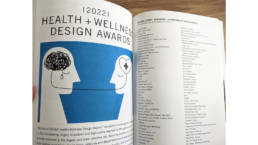
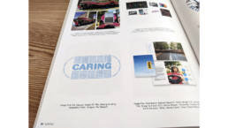
Year: 2022
Award: GDUSA Health + Wellness Design Awards
Background
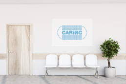
Wearing a mask helps prevent the spread of COVID-19
This project sprang from this idea of consideration and caring that I observed in Japan. I have observed that many COVID-related issues stem from the frustrations people feel while waiting. Waiting often results in people looking at their phones, which creates an individual bubble of awareness around a person. These individual bubbles create an environment in which people are not interacting with one another. I’ve observed the inconsistencies around mask wearing in these waiting processes.
Places like restaurants no longer require face coverings, while other businesses have signs stating masks are no longer required if you’ve been vaccinated. Based on my observations, I have noticed that people in Japan are more considerate about mask wearing in public.
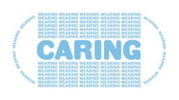
I designed a poster for COVID-19 prevention to display in public waiting rooms incorporating the word “caring”: Caring for others; Caring for those who are unable to get vaccinated or to wear a mask; Caring for the community.
Process
Concept
Wearing is such a small action. Caring has a large impact on those around us.
When my friend was teaching her son to share his toys with his siblings and friends, she often used the phrase “sharing is caring.” The little boy wanted to impress his mom, so he immediately began sharing his toys with his sister. This is the principle behind Wearing is Caring. I adapt this commonly understood phrase to another important concept around caring for others.
Although wearing a mask is a small action, caring has a large impact on those around us, which is the idea behind the size of the text. It’s not about protecting oneself, but rather protecting others. The repeated “WEARING” indicates wearing a mask more frequently and in different places. When you wear a mask more often, you are showing you care about others.
The words are shaped like a face mask to convey the message to people who may not understand English but will recognize the image and be inspired to wear a mask. I chose the color blue because it is often associated with cleanliness and is frequently used to brand healthcare. The light blue I chose is similar to the color of surgical masks in the United States. Also, according to color psychology studies, blue evokes calmness and serenity.
Typefaces
Geometric sans serif for simplicity and readability.
Gothic Round, used for “CARING,” and Poppins, used for “WEARING,” convey friendliness, an approachable vibe, and readability. As a design student at UT Austin, I had access to Rob Roy Kelly American Wood Type Collection and letterpress printers in the Design Lab, so I printed CARING first with letterpress and WEARING around it with a digital printer.
Both Gothic Round and Poppins are sans serif typefaces, but their tones differ. While Poppins has a modern and elegant look with clean sharp lines, Gothic Round has a retro look with smooth curved lines that make it friendly and playful. I enjoy the contrast between the two.

Ⓒ 2024 Rie Takeuchi