Brand IdentityIllustration
Peeps for Social Good
From Concept to Canvas: A Case Study in Brand Expression
Year: 2023
Collaborator: Aspen Labs
Background
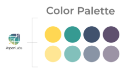
Aspen Labs, an innovative human-centered design firm located in Denver, recently adopted a refreshed brand identity marked by a distinctive logo showcasing a vibrant maple leaf in gradient hues. Seeking to fortify their brand presence, the firm recognized the potential of enhancing their identity through the creation of impactful swag.
As the Designer-in-Residence at the firm, I worked closely with Christi Zuber and Mike Lin to co-create the concept for the illustration and its accompanying message.
Development
For the first step, I facilitated a brainstorming session to uncover potential taglines and illustrations. Our exploration focused on Aspen Labs’ core values, target audience, distinctive qualities within the consultancy field, and defining attributes.
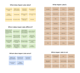
Then, drawing inspiration from the potential headlines crafted with ChatGPT, we leveraged the 2×2 Prioritization Matrix to pinpoint the most apt taglines for the brand.

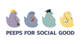
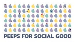
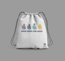
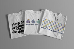
“Peeps for Social Good” was settled upon after a few changes.
Peeps, while initially unfamiliar to me, carry a dual significance that signifies both individuals and those beloved marshmallow confections shaped as chicks and bunnies. While staying true to the brand colors of Aspen Labs, these diverse Peeps symbolize unity, acceptance, and hope.
Final Products
Ⓒ 2024 Rie Takeuchi